Tuesday, 14 June 2016

It's very airy, isn't it, Maudie?

Recognising one of McGill's designs, especially an early one, can be quite difficult as he didn't always sign them. This example is clearly one of his because it is signed.

Unknown publisher No. 1009
Early 1910s

Finding the above card is useful confirmation when you come across the one below which is obviously the same ... but for some reason isn't signed although it appears to be exactly the same design apart from the colour difference due to different printers. It is also slightly cropped and the type font is different.

Published by Joseph Asher & Co., No 185
Postmarked 1911


If the top design had not been signed there could have been some doubt about whether it was a McGill or not especially with there not being a publisher's mark either. Although, I'm guessing, most collectors would have recognised his style. However, the bottom design would have been easier to attribute to McGill without a signature because it was published by Joseph Asher & Co.

So why was one signed and not the other?


Monday, 4 April 2016

New section on McGill's Publishers

I've just added a new page about the different publishers identified with McGill's postcards. See the link on the navigation bar at the top of the blog just below the image and title.

Publishers are another confusing element of the McGill story. The information I have is limited in many cases. Even the few books about McGill do not have any great detail about the publishers apart from the obvious main ones - Joseph Asher & Co., Inter-Art Co. and D Constance Ltd.  I intend to update the page about publishers as and when I come across anything new.

McGill is definitely known to have worked with certain publishers but his periods of freelance work are much hazier. Plus there may have been some unscrupulous publishers who printed his cards without permission. The full story may never be clear!

Friday, 6 November 2015

Your head is like his behind

If McGill liked a joke then he was quite happy to use it again and again if he could. This is a classic example with six (so far!) different printings using the same joke. 

The earliest version is this one, E.S 3104 which is postmarked 1911 but was probably published in 1907 or 1908. (Thanks to David White for sending me this version.)


Then he reused the joke in a totally different setting for this card published by Joseph Asher & Co., No. A26 which is postmarked 1914.


Of the others one returns to the seaside setting while the other three are set in a church. All updated versions from the late 1920s to the late 1930s / early 1940s.


Published by Inter-Art Co. Ltd.
Comique Series No. 5106


Published by Inter-Art Co. Ltd.
Comique Series No. 7785 (Postmarked 1947)


Published by D. Constance Ltd., No. 1041
(Postmarked 1946)

           
Published by D. Constance Ltd., No. 1041


Sponging his Aspidistra

This wonderful double entendre has been published in two versions. I'm sure a fashion expert could probably pinpoint which came first.

In the early part of the 20th century almost every middle class home would have had an aspidistra plant.

Both cards are published by D. Constance Ltd., No. 1038


Both versions have the "Keep Saving For A Rainy Day" rhyme on the reverse. I also have a copy of the card on the right which doesn't have the rhyme and could indicate that it is the later version.


Wednesday, 27 May 2015

They're off

This rather weak joke seems to have made a popular card as I have come across three versions of it although two of them are very similar.

Published by D. Constance Ltd. No. 689

This first one pictured appears to be the original drawing. It has the "Keep Saving For A Rainy Day. The war is won, your £.s.d...." rhyme on the reverse

This second one also has the same "Keep Saving ..." rhyme but there are significant differences to the original.

This final version does not have the rhyme and the reverse looks to be much more recent, post rationing Britain rather than pre-war. However it is very similar to the second version except that the backgrounds are different. The difference in this case may be more to do with the printing process rather than McGill redrawing the image


Monday, 20 April 2015

I'm putting on tons

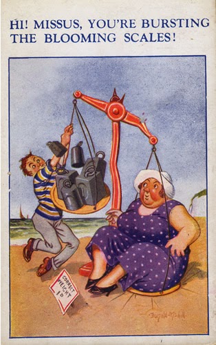
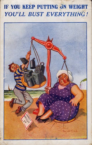
The fat lady on holiday destroying weighing machines is a theme McGill returned to again and again. In this particular version the image has been published with at least three different captions.

Published in the XL Series.
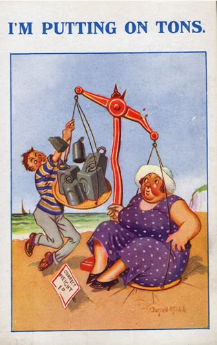

No. 2045

No. 2045 A

No. R. 2045
(Postmarked 1935)


When people went on their annual week's holiday they would often have the chance to eat better than they would for the rest of the year. And not having to work meant they didn't burn off the calories. The result being that many people would return from holiday having put on weight and this was the basis for all the postcard jokes about fat people on holiday.

McGill seems to have been in favour of sex equality as he would often do a male and female version of the same situation. There are some weighing machine cards where he has done this, although I have not come across a male equivalent of this one yet.

Tuesday, 3 March 2015

Some panes have gone

I only have  a small collection of the XL Series cards - probably about 200 - but there appears to be a disproportionally large number of these that have the same image used more than once compared to some of the other publishers' cards.

If you come across an XL Series card that has a number with a 'R', 'V' or 'A' then there is almost certainly another version of it out there with a different caption. This is quite useful so you can keep an eye out for the variant.

However, I recently came across an example which doesn't have any of these extra letters appended to the number. The following two cards are both published as XL Series No. 2165: